SwishSolar
Complete brand overhaul and digital transformation for a solar technology company, aligning their visual identity with their innovative nano-film and AI scheduling products.
Team
Tools
Elevating Solar Technology
SwishSolar approached me with a critical challenge: their existing digital presence was built on a generic template that failed to communicate the sophistication of their technology. As a company targeting corporate clients and investors, they needed a brand that exuded trust, innovation, and reliability. Working directly with CEO Miswar Syed, I executed a complete rebrand and developed a high-performance website that accurately reflects their position as a leader in solar maintenance technology.
Understanding the Core Technology
The Product Ecosystem
To design an effective brand, I first needed to deeply understand SwishSolar’s two core products. The design needed to communicate the distinct value of each while maintaining a unified brand voice.
- Nano Film Technology
- A revolutionary thin film that automatically cleans solar panels.
- Specifically engineered for harsh desert environments where dust and dirt significantly reduce solar panel efficiency.
- SwishOS Platform
- An intelligent scheduling platform for solar cleaning.
- Uses algorithms to find the most optimal times for cleaning to maximize energy output.
Target Audience Analysis
The primary audience for SwishSolar is not residential homeowners, but rather corporate clients and large-scale investors. This distinction was crucial. The visual language needed to move away from "friendly residential solar" tropes and towards a "high-tech industrial solution" aesthetic. The goal was to instill confidence in stakeholders looking for scalable, efficient infrastructure solutions.
Building a Visual Identity
Moodboard Presentation
To establish a clear visual direction early in the process, I presented the client with a series of comprehensive moodboards exploring different thematic directions. Each moodboard represented a distinct aesthetic approach tailored to the solar technology industry.
- Moodboard Options
- Desert Dawn: Warm, sunrise-inspired palette emphasizing new beginnings
- Earth and Teal Sky: Natural, grounded tones with high-tech accents
- Desert Sun: Bold, energetic aesthetic focused on solar intensity
- Ice Cold: Cool, precise palette suggesting efficiency and technology
- Solar Flare: Dramatic, high-contrast theme emphasizing power

Comprehensive moodboard presentation showing all style options offered to the client
The Chosen Direction: Desert Dawn
After reviewing all options, the client gravitated towards the "Desert Dawn" theme. This choice made strategic sense: SwishSolar's clients primarily operate in desert environments, and this theme resonates deeply with the operational context of the technology. The moodboard served as a guiding compass throughout the entire design process, ensuring consistency from brand identity through to final implementation.
Brand Guide & Visual System
I developed a comprehensive brand guide that established the foundation for all visual communications. The guide specified typography, color palette, and usage guidelines to ensure consistency across all touchpoints.
- Typography
- Readex Pro: Primary display font for headings and impact
- Inter: Body text font for clarity and readability
- Primary Colors
- Metallic Orange: Represents solar energy and innovation
- Charcoal Blue: Conveys professionalism and trust
- Complementary Tones
- Alabaster: Soft neutral for backgrounds and spacing
- Ghost White: Clean accent for contrast and breathing room

Minimal brand guide showing typography choices and color palette
Brand Logo Redesign
The existing logo needed modernization to reflect SwishSolar's innovative technology. I redesigned the brand symbol to represent the core product: a thin film over a solar panel, forming the shape of an "S" letter. This visual metaphor directly communicates the company's unique value proposition.

Brand symbol redesign showing the thin film concept forming the S letter
Final Logo Design
The final logo combines the symbolic "S" with clean, modern typography that aligns with the Desert Dawn theme. The logo works seamlessly across digital and physical applications, from website headers to printed materials.
Final logo design with brand symbol and wordmark
Comprehensive Brand Collateral
Marketing & Business Materials
Beyond the digital presence, I designed a complete suite of graphic materials to support SwishSolar's business development and marketing efforts. Each piece adhered to the brand guide, creating a cohesive visual ecosystem across all customer touchpoints.
- Business Essentials
- Business Cards: Professional cards with the new logo and brand colors
- Invoice Letters: Branded templates for client communications
- Marketing Collateral
- Brochures: Product information sheets highlighting nano-film technology
- Banners: Trade show and event displays
- Posters: Informational and promotional materials
- Brand Merchandise
- Apparel: Company t-shirts, hats, and uniforms for team cohesion

Suite of graphic design materials including business cards, brochures, banners, and apparel
From Concept to Code
Information Architecture
Before diving into design, I have offered a proposal to the client with a detailed breakdown of the project scope, timeline, and budget. I have also mapped out the information architecture for the entire website. This involved defining the site structure, user flows, and content hierarchy to ensure intuitive navigation for both corporate clients and investors.

Information architecture diagram showing site structure and user flows
Lo-Fi Wireframes
With the architecture in place, I created low-fidelity wireframes to quickly iterate on layout concepts. These wireframes focused on content placement, user flow, and functional requirements without getting distracted by visual details.

Low-fidelity wireframes exploring layout and content structure
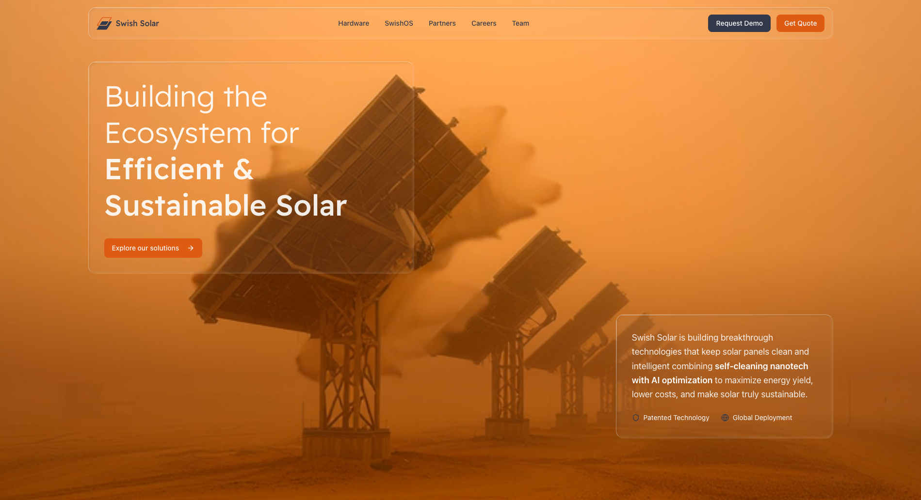
Visual Language: Glassmorphism
To visually represent the core product—the thin, transparent nano-film—I adopted a Glassmorphism aesthetic for the UI. This style uses translucent, glass-like elements to create depth and hierarchy. It serves as a subtle but powerful metaphor for the invisible yet protective nature of the nano-film layer on the solar panels.

Glassmorphism elements in the website representing the nano-film technology
SwishOS Integration
A key part of the project was ensuring consistency between the marketing website and the SwishOS platform. Along with Farosat Alamshoeva, we have redesigned the SwishOS interface to align with the new "Desert Dawn" branding. This ensures that when an investor or client moves from the marketing site to the product demo, the experience is seamless and professional.

SwishOS interface redesigned to align with the new "Desert Dawn" branding
Built with Next.js and React
The website was designed and built using Next.js with React, replacing the original Framer template. This modern tech stack enabled superior performance, SEO optimization, and scalability for future growth.
- Next.js: Server-side rendering for optimal performance and SEO
- React: Component-based architecture for maintainability
- TypeScript: Type safety and better developer experience
- Tailwind CSS: Efficient styling system aligned with brand guide
Visual Transformation
The new design successfully positions SwishSolar as a premium technology provider. The clean, glass-like interface combined with the warm desert tones creates a unique identity that stands out in the industrial solar market.


See it in Action
Experience the new SwishSolar website firsthand and explore its innovative solar technology solutions.
Impact & Conclusion
Positioned for Growth
The redesign of SwishSolar’s digital presence has been a resounding success. By moving away from a generic template to a custom-built, brand-centric platform, we have successfully positioned SwishSolar as a premium technology provider in the renewable energy sector.
- Client Satisfaction
- CEO Miswar Syed expressed high satisfaction with the new brand identity, noting that it finally reflects the innovative nature of their nano-film technology.
- Investor Confidence
- The clear, professional presentation of the SwishOS platform and core technologies has made it easier for the company to communicate its value proposition to corporate clients and investors.
- Unified Ecosystem
- The consistent design language across the marketing site and the SwishOS platform has created a seamless user experience, reinforcing brand trust at every touchpoint.